There are a lot of articles and blog posts out there on how to handle OAuth2 authentication when connecting to REST APIs from Power Query in Power BI. However there is also a lot of confusion and contradictory information too so in this post I want to give you the definitive, Microsoft-endorsed answer to this question, which is:
If want to connect from Power BI to a REST API that uses OAuth2 authentication then you need to build a custom connector. You can find documentation on how to implement an OAuth2 flow in a custom connector here.
The only exception is that you can connect to some APIs that use AAD authentication using the built-in web or OData connectors, as documented here.
A quick web search will turn up several examples of how to implement an OAuth2 credential flow in regular Power Query queries without needing a custom connector. This is not recommended: it’s not secure and it’s not reliable. In particular, hard-coding usernames/passwords or client ids/client secrets in your M code is a really bad idea. What’s more requesting a new token every time a query runs isn’t great either.
Unfortunately Excel Power Query doesn’t support custom connectors at the time of writing. Also, if you use a custom connector in the Power BI Service then you’ll need to use an on-premises gateway. Finally, there’s an article here explaining why it isn’t easy to connect Power BI to the Microsoft Graph API.
[Thanks to Curt Hagenlocher and Matt Masson for the information in this post]
You may have noticed that a new dataflows connector was announced in the August 2021 release of Power BI Desktop, and that it now supports query folding between a dataset and a dataflow – which you may be surprised to learn was not possible before. In this post I thought I’d take a look at how much of an improvement in performance this can make to dataset refresh performance.
For my tests I created a new PPU workspace and a dataflow, and made sure the Enhanced Compute Engine was turned on for the dataflow on the Settings page:
Query folding will only happen if the Enhanced Compute Engine is set to “On”, and won’t happen with the “Optimized” setting. The Enhanced Compute Engine is only available with PPU and Premium.
For my data source I used a CSV file with a million rows in and seven integer columns. I then created two tables in my dataflow like so:
The Source table simply connects to the CSV file, uses the first row as the headers, then sets the data type on each column. The second table called Output – which contains no tranformations at all – is needed for the data to be stored in the Enhanced Compute Engine, and the lightning icon in the top-left corner of the table in the diagram shows this is the case.
Next, in Power BI Desktop, I created a Power Query query that used the old Power BI dataflows connector:
If you have any existing datasets that connect to dataflows, this is the connector you will have used – it is based on the PowerBI.Dataflows function. My query connected to the Output table and filtered the rows to where column A is less than 100. Here’s the M code, slightly edited to remove all the ugly GUIDs:
let
    Source = PowerBI.Dataflows(null),
    ws = Source{[workspaceId="xxxx"]}[Data],
    df = ws{[dataflowId="yyyy"]}[Data],
    Output1 = df{[entity="Output"]}[Data],
    #"Filtered Rows" = Table.SelectRows(Output1, each [A] < 100)
in
    #"Filtered Rows"
Remember, this connector does not support query folding. Using this technique to measure how long the query ran when the results from the query were loaded into the dataset, I could see it took almost 12.5 seconds to get the data for this query:
In fact the performance in Desktop is worse: when refresh was taking place, I could see Power BI downloading 108MB of data even though the original source file is only 54MB.
Why is the data downloaded twice? I strongly suspect it’s because of this issue – because, of course, no query folding is happening. So the performance in Desktop is really even worse.
I then created the same query with the new dataflows connector:
This connector uses the PowerPlatform.Dataflows function; it’s not new, but what is new is that you can now access Power BI dataflows using it.
Here’s the M code, again cleaned up to remove GUIDS:
let
    Source = PowerPlatform.Dataflows(null),
    Workspaces = Source{[Id="Workspaces"]}[Data],
    ws = Workspaces{[workspaceId="xxxx"]}[Data],
    df = ws{[dataflowId="yyyy"]}[Data],
    Output_ = df{[entity="Output",version=""]}[Data],
    #"Filtered Rows" = Table.SelectRows(Output_, each [A] < 100)
in
    #"Filtered Rows"
When this query was loaded into the dataset, it only took 4 seconds:
This is a lot faster, and Power BI Desktop was a lot more responsive during development too.
It’s reasonable to assume that query folding is happening in this query and the filter on [A]<100 is now taking place inside the Enhanced Compute Engine rather than in Power BI Desktop. But how can you be sure query folding is happening? The “View Native Query” option is greyed out, but of course this does not mean that query folding is not happening. However, if you use Query Diagnostics, hidden away in the Data Source Query column of the detailed diagnostics query, you can see a SQL query with the WHERE clause you would expect:
In conclusion, you can see that the new dataflows connector can give you some big improvements for dataset refresh performance and a much better development experience in Power BI Desktop. Query folding support also means that you can now use dataset incremental refresh when using a dataflow as a source. However, you will need to use Premium or PPU, you may also need to make some changes to your dataflow to make sure it can take advantage of the Enhanced Compute Engine, and you will also need to update any existing Power Query queries to use the new connector. I think the potential performance gains are worth making these changes though. If you do make these changes in your dataflows and find that it helps, please leave a comment!
You probably know that it’s a best practice to build your Power BI datasets in a separate .pbix file from your reports – among other things it means that different people can develop the dataset and reports. You may also know that if you are building a report in Power BI Desktop with a Live connection to a published dataset or Azure Analysis Services you can define your own measures inside the report. While this is very convenient, if you create too many measures there’s a price to pay in terms of query performance.
To illustrate this, let’s say you have a super-simple dataset published to the Power BI Service (or a database in Analysis Services Tabular or Azure Analysis Services) that contains one table with three rows in it, two columns and a simple measure:
If you open Power BI Desktop and create a Live connection to this dataset, you can create a new measure in the normal way and then use it in a table like so:
If you take a look at the DAX query that is generated by this table visual you’ll notice that the MyReportMeasure measure, defined in the report, is defined at the top of the query while the Sales Amount measure, defined in the dataset, is not:
Here’s what DAX Studio’s Server Timings shows about this query when it runs on a cold cache:
As you would expect it’s pretty quick, taking just 16ms.
In this example MyReportMeasure is something known as a query-scoped measure: it is created when the query runs and ceases to exist when the query finishes. The problem with this is that creating a query has some costs associated with it: for example, Power BI/Analysis Services needs to do some dependency analysis to find out what other measures it refers to, and the more other measures there are, the longer this takes.
To show the impact I generated the DAX definition of 3000 measures in Excel and pasted them into the DEFINE clause of the query above:
[NB this is not exactly what happens in the real world: only the measures you need for a query, and the measures that these measures depend on, are defined in the query but the dependendency analysis happens all the same]
Here’s what Server Timings showed for the same query – which, remember, does not actually used any of the 3000 measures that I added:
Now 3000 measures might seem excessive but I have seen people with that many: you could have 100 base measures and then 30 combinations of different KPIs (time intelligence calculations, financial calculations like actual vs forecast and so on). My advice would be to use calculation groups instead of creating so many measures, if you can – they will be a lot easier to develop and maintain, and for anyone developing a report to use. It’s also worth making clear that this problem only happens with query-scoped measures: no dependency analysis takes place at query time with measures defined on the dataset.
Also 1.5 seconds might not seem a big overhead but if you’re trying to squeeze all the performance you get out of a query, or trying to understand what’s contributing to the overall performance of your query, this is good to know about.
[Thanks to Jeffrey Wang for providing the information in this post]
In the last post in this series I showed how you can use Excel’s new Lambda helper functions to return tables. In this post I’ll show you how you can use them to return a dynamic array of CubeSet functions which can be used to build a histogram and do the kind of ABC-type analysis that can be difficult to do in a regular Power BI report.
For the examples in this post I added some rows to the Excel Data Model table that I’m using to hold my source data:
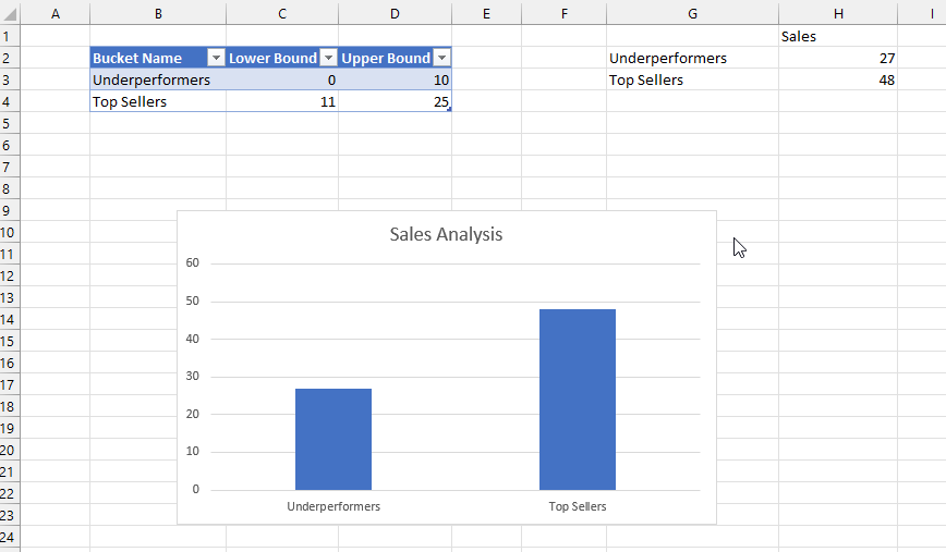
The aim here is to put these products into an arbitrary number of groups, or buckets, based on their sales. To define these buckets I created another Excel table called Buckets that has three columns: the name of the bucket, and the lower bound and the upper bound of the sales amount that determines whether a product should fall into the bucket:
I then created two dyanmic array formulas using the new Map function. In cell G2 I added this formula:
=
MAP(
 Buckets[Bucket Name],
 Buckets[Lower Bound],
 Buckets[Upper Bound],
 LAMBDA(
  n,
  l,
  u,
  CUBESET(
   "ThisWorkbookDataModel",
   "FILTER([Sales].[Product].[Product].MEMBERS, [Measures].[Sales Amount]>=" & l &
   " AND [Measures].[Sales Amount]<=" & u & ")",
   n)
  )
)
The formula in G2 takes three arrays – the values from the three columns in the Buckets table – and then loops over the values in those columns and uses the CubeSet function to return a set of the Products whose sales are between the lower and upper bounds. Since there are two rows in the Buckets table, this formula returns two sets. The formula in H2 uses the CubeValue function to return the aggregated sales amount for each set.
Last of all I created a column chart bound to the values in G2 and H2. This was a bit tricky to do, but I found the answer in this video from Leila Gharani – you need to create names that return the contents of the ranges G2# and H2# and then use the names in the chart definitions.
The beauty of all this is what when you edit the ranges in the Buckets table in the top left of the worksheet, edit the names of the buckets or add new buckets, the table and chart update automatically.
After doing all this I realised there was another, probably easier way to achieve the same result without using the Map function. All I needed to do was to add new calculated columns to the bucket table to return the sets and values:
Here’s the formula for the Set column in the table above:
In the first post in this series I showed how to use the new Excel Lambda helper functions to return an array containing all the items in a set. That isn’t very useful on its own, so in this post I’ll show you how to generate an entire dynamic table using Excel cube functions and Lambda helper functions.
In this post I’ll be using the same source data as in my previous post: a table containing sales data with just two columns.
With this table added to the Excel Data Model/Power Pivot, I created two measures:
I then created created two sets using CubeSet containing the sets of Products (in cell B2 of my worksheet) and Measures (in cell B4) to use in my table:
How does this work? Going through the MakeArray function step-by-step:
The first two parameters specify that the output will be an array with one more row than there are items in the Product set and one more column than there are items in the Measures set.
The third parameter returns a Lambda that is called for every cell in this array. This Lambda contains a Switch with the following conditions:
For the top-left cell in the array, return a blank value
In the first column, use the CubeRankedMember function to return the Products on the rows of the table
In the first row, use the CubeRankedMember function to return the Measures on the columns of the table
In the body of the table, use the CubeValue function to return the values
Here’s a slightly more ambitious version that returns the same table but adds a total row to the bottom:
This is a great example of a complex formula where the new Excel Let function can be used to improve readability and prevent the same value being evaluated twice.
The values in the Total row are calculated in the Excel Data Model, not on the worksheet, by using the CubeSet function inside the CubeValue function. This means that the totals will be consistent with what you see in a PivotTable and therefore correct
This is still very much a proof-of-concept. I need to look at the performance of this approach (it may not be optimal and may need tuning), and I’m not sure how a table like this could be formatted dynamically (especially the Total row). It is exciting though!
After my recent post on using Office Scripts and cube functions to generate Excel reports from Power BI data, Meagan Longoria asked me this question on Twitter:
To which I can only reply: guilty as charged. I have always loved the Excel cube functions even though they are maybe the least appreciated, least known and least used feature in the whole Microsoft BI stack. They have their issues (including sometimes performance) but they are great for building certain types of report in Excel that can’t be built any other way.
Anyway, the recent addition of new Lambda helper functions to Excel has made me particularly happy because they can be used with cube functions to overcome some limitations that have existed since cube functions were first released in Excel 2007, and to do some other cool things too. In this series of posts I’m going to explore some of the things they make possible.
Let’s start with something simple. In Excel, the CubeSet function can be used to return an (MDX) set of items. This set is stored in a single cell, though, and to extract each item into a cell on your worksheet you need to use the CubeRankedMember function. For example, let’s say I have a table called Sales on my worksheet:
…that is then loaded into the Excel Data Model (aka Power Pivot – although this works exactly the same if I use a Power BI dataset, Azure Analysis Services or SQL Server Analysis Services as my source):
What you can then do is use the CubeSet function to create a set of all the products like so:
…and then use the CubeRankedMember function to put each individual item of the set into a cell. Here’s a simple example worksheet, first with the formulas showing and then the results:
This example shows the fundamental problem that has always existed with CubeRankedMember though: in order to show all the items in a set you need to know how many items there are in advance, and populate as many cells with CubeRankedMember formulas as there are items. In this case see how the range B4:B6 contains the numbers 1, 2 and 3; these numbers are used in the formulas in the range C4:C6 to get the first, second and third items in the set.
If a fourth product was added to the table, however, it would not appear automatically – you would have to add another cell with another CubeRankedMember formula in it manually. I’ve seen some workarounds but they’re a bit hacky and require you to know what the maximum possible number of items in a set could ever be. Indeed that’s always been one of the key differences between cube functions and PivotTables: cube functions are static whereas PivotTables can grow and shrink dynamically when the data changes.
The new MakeArray function in Excel provides a really elegant solution to this problem: you can now write a single formula that returns a dynamic array with all the items in the set in. Assuming that the same CubeSet exists in B2 as shown above, you can do the following:
Notice how the formulas in cell B4 returns an array that contains all three items in the set into the range B4:B6.
How does this work?
The CubeSetCount function is used to get the number of items in the CubeSet in B2.
The MakeArray function is then used to create an array with the number of rows returned by CubeSetCount and one column
In the third parameter of MakeArray the Lambda function is used to return a function that wraps CubeRankedMember, which is then called with the current row number of the array
The nice thing about this is that when more products are added to the Sales table they automatically appear in the output of the MakeArray formula in B4. So, for example, with two more products added to the Sales table like so:
Here’s the new output of the formula, showing the two new products returned in the array automatically:
This is not very useful on its own though. In my next post I’ll show you how this can be used to build a simple report.
A quick note for anyone like me who spends too much time looking at the JSON exports from Performance Analyzer in Power BI Desktop: you may have noticed an event called Query Pending that isn’t (as yet) documented in the Word doc that explains the format of these JSON files.
It turns out that it’s not that interesting – it’s an event that has been added as part of an effort to make sure there are events to cover the whole of the query lifecycle. After the DAX queries for each visual in your report are generated they are added to a queue before they are executed. In some cases there could be several queries in the queue waiting to be executed, in which case they are said to be “pending”, and the Query Pending event tells you how long a query is in this pending state.
I haven’t seen a duration of longer than a couple of milliseconds for this event though, so you probably don’t need to worry much about it. If you ever do see a long Query Pending event please leave a comment – I’m curious to know what the cause might be.
[Thanks to John Vulner and Jon Ludwig for this information]
Now that Excel reports connected to Power BI datasets work in Excel Online it opens up a lot of new possibilities for doing cool things with Office Scripts and Power Automate. Here’s a simple example showing how all these technologies can be put together to automatically generate batches of Excel reports from a template.
Step 1: Create a template report in Excel using cube formulas
In Excel on the desktop I created a new Excel file, created a connection to a Power BI dataset and then built a simple report using Excel cube formulas:
Here are the Excel formulas for the table on the left:
This report uses data from the UK’s Land Registry (one of my favourite data sources) and shows the average price paid and number of sales broken down by property type for a single county (specified in cell B2 of this report – in the screenshot above data for Bournemouth is shown). Here’s the formula in B2:
This formula is referenced by all the CUBEVALUE formulas in the body of the table so they are all sliced by the selected county.
After doing this, I saved the file to OneDrive for Business.
Step 2: Create an Office Script to change the county shown in cell B2
The aim of this exercise is to generate one copy of the report above for each county in a list of counties, so the next thing I did was create a parameterised Office Script that takes the name of a county and changes the county name used in the formula in cell B2. To do this I opened the Excel report in Excel Online, started the script recorder, changed the formula in B2 and then stopped recording. I then edited this script to take a parameter for the county name (called county) to use in the formula. Here’s the script:
function main(workbook: ExcelScript.Workbook, county: string) {
	let selectedSheet = workbook.getActiveWorksheet();
	// Set range B2 on selectedSheet
	selectedSheet.getRange("B2").setFormulaLocal("=CUBEMEMBER(\"Price Paid\", \"[Property Transactions].[County].[All].[" + county + "]\")");
}
Step 3: Create a list of counties to pass to the script
Next, I created a second Excel workbook containing a table that contained the county names to pass to the script and saved this to OneDrive for Business too:
Step 4: Create Power Automate flow to call the script once for each county in the Excel table
Last of all, I created a Power Automate flow that reads the county names from the table in the previous step, runs the script for each county, creates a copy of the original Excel report after each script run and then saves it to a folder. Here’s the flow at a high level:
In more detail, here’s the setup for the ‘List rows present in a table’ action:
Here’s the ‘Run script’ action:
Here’s the expression used to get the current county name in the loop:
items('CountyLoop')?['Counties']
…and here’s the expression used to create the destination file path:
Running this flow results in three Excel workbooks being created, one for each county with the county name in the workbook name, stored in a folder like so:
Here’s the report in BATH AND NORTH EAST SOMERSET.xlsx:
Of course I could do other things at this point like email these workbooks to different people, but there’s no need to overcomplicate things – I hope you’ve got the idea.
A few last points to make:
Office Scripts don’t seem to work with PivotTables connected to Power BI datasets yet – I’m sure it’s just a matter of time before they do though
How is this different from using Power Automate to call the Power BI export API? A paginated report can be exported to Excel but this method gives you a lot more flexibility because it allows you to use a lot more Excel functionality, not jus the functionality that paginated reports can use in its exports. It also gives you a report that is connected live back to a dataset using cube functions, not static data.
Generating large numbers of Excel reports like this is not something I like to encourage – why not view your report in the Power BI portal, especially now you can view live Excel reports connected to datasets there too? – but I know it’s something that customers ask for .
I haven’t done any performance testing but I suspect that this method may be faster than using the Power BI export API in Power Automate.
If you’ve been following some of my recent posts about improving Power BI refresh performance by partitioning tables you will have seen a lot of screenshots that look like the one below:
It’s a visualisation from a report created by my colleague Phil Seamark (as detailed in this blog post) showing how long all the partitions in a dataset take to refresh. If you look at these visualisations you’ll probably ask the same question I did: why does the first partition always start before the others?
It turns out this is because when a table is refreshed, the first thing that has to happen is that a certain amount of data is read so the type of encoding (Value or Hash) used for each column is determined. In most cases tables only contain one partition so it’s not obvious that this is happening, but when a table has more than one partition this happens only for the first partition – which explains why the first partition seems to start before the others. You can’t avoid it happening but you can reduce the impact a little by using encoding hints (see here and here for more details): this process can be skipped for columns that have a Hash encoding hint, or which the engine knows in advance have to use Hash encoding, although it cannot be skipped for columns that have a Value encoding hint. What’s more the Execute SQL event for the first partition will have to complete before the Execute SQL events for all the other partitions can start.
[Thanks to Akshai Mirchandani for the information in this post]
There were a couple of new features and enhancements to existing features in the June 2021 Power BI Desktop release that don’t seem to have much to do with each other but which I think can be combined to do cool things. They are:
First of all, let’s start with native SQL support in the Snowflake connector. I deal with a lot of customers who use Snowflake and Power BI together and I know just how much people have wanted this. What does it allow you to do? Well, you have always been able to use the Power Query Editor to transform data coming from Snowflake in either Import mode or DirectQuery mode. Now, though, you can write your own native SQL query and use it as the source for a Power Query query (something that has always been possible with some other connectors, such as the SQL Server connector). Incidentally, this also means that the EnableFolding=true option for Value.NativeQuery that I blogged about recently also now works for Snowflake too.
The main reason you’d want to use a native SQL query when connecting to Snowflake, or indeed any database, is to do something that’s possible in SQL but not in Power Query. One example of this is to use regular expressions to filter data. I have the AdventureWorks DW DimCustomer table loaded into Snowflake and I can use Snowflake’s REGEXP function to filter on the LASTNAME column something like this:
SELECT
DISTINCT FIRSTNAME, LASTNAME, ENGLISHOCCUPATION
FROM "AWORKS"."PUBLIC"."DIMCUSTOMER"
WHERE LASTNAME REGEXP 'To.*'
So that’s useful. I can use a query like this as the source of a table in DirectQuery mode in Power BI, but wouldn’t it be useful if end users of my report could change the regular expression used to filter the data? This is where dynamic M parameters come in. Assuming I have a table of pre-defined regular expressions:
And an M parameter:
…I can write an M query like this that uses the M parameter to return the regular expression used in the WHERE clause of the SQL query:
let
  Source = Value.NativeQuery(
    Snowflake.Databases(
      "mysnowflake.com",
      "DEMO_WH"
    ){[Name = "AWORKS"]}[Data],
    "SELECT DISTINCT FIRSTNAME, LASTNAME, ENGLISHOCCUPATION
    FROM ""AWORKS"".""PUBLIC"".""DIMCUSTOMER""
    WHERE LASTNAME REGEXP '"
      & pRegEx
      & "'",
    null,
    [EnableFolding = true]
  )
in
  Source
…and then turn this into a dynamic M parameter in the Power BI diagram pane:
…and get a report that does this:
One limitation of dynamic M parameters in regular Power BI reports today is that the values you pass into them have to come from a column somewhere inside your dataset, so all of these values have to be pre-defined. Wouldn’t it be useful if the end user could enter any regular expression that they wanted though? That may not be possible in a regular Power BI report but it is possible with a paginated report, because with paginated reports you can write whatever DAX query you want – and therefore pass any value you want to a dynamic M parameter – and also, in a paginated report, you have the option of creating parameters where the user can enter whatever value they want.
I blogged about how to write DAX queries that contain dynamic M parameters here. Here’s an example of a parameterised DAX query (yes, I know, so many types of parameters…) that takes a regular expression and the name of an occupation and returns a table of customers whose last names match the regular expression and whose occupations match the one entered:
This can be used in a paginated report dataset connected to the Power BI dataset created above (yes, I know, so many types of datasets…) like so:
….which can then be used to build a paginated report that does this:
And of course, with the new paginated report visual, this paginated report can be embedded in a regular Power BI report:
All this is very much a proof-of-concept and not something I would recommend for production (I would be worried about SQL injection attacks for a start). There are more enhancements to these features still to come too. However, I do think it’s interesting to see how these features can be put together now and to imagine how they could be used in the future. What do you think?