Sharing Excel Reports Connected To Power BI Datasets Or The Excel Data Model/Power Pivot Using OneDrive For Business

I love Excel as an alternative to Power BI reports, especially now that Excel Online allows you to interact with browser-based Excel reports that use Power BI datasets or the Excel Data Model (aka Power Pivot) as a source. After all, why try to recreate a PivotTable in a Power BI report when you can give your users an actual PivotTable? You can publish Excel reports to Power BI and view them there; however if you want to share these reports using OneDrive for Business, outside Power BI, you’ll need to think carefully about how you do so before you allow other people to view the report.

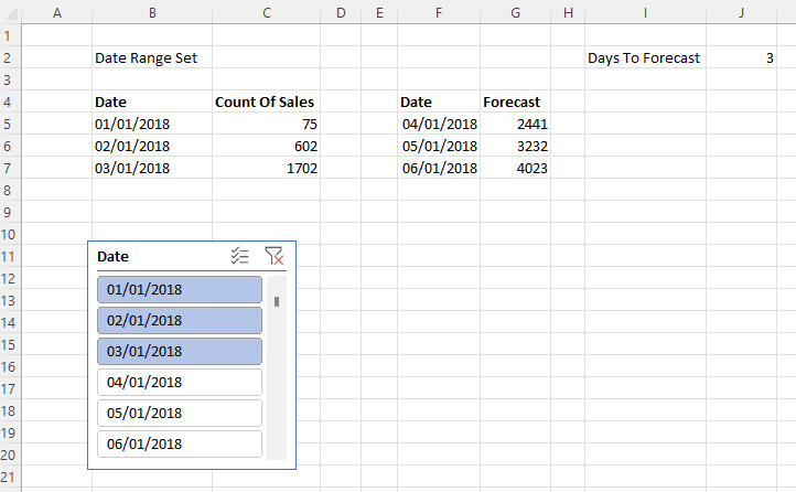
To illustrate the problem I used Power Pivot to load some data into the Excel Data Model, built a simple report with a PivotTable and PivotChart, saved it to OneDrive for Business and then opened it in the browser with Excel Online. As you can see it’s possible to interact with the report in the browser, changing slicers and moving fields around in the PivotTable and PivotChart field lists:

So far so good. However, an Excel file saved to OneDrive for Business is a shared document – and any changes that one user makes are immediately visible to all other users who have access with full Edit permissions. This means that if you change a slicer and someone else is viewing my report at the same time, they will see the slicer change too in real-time. This may be useful in scenarios where you are collaborating with someone on the same report and want them to see your changes, but in most cases this is not desirable behaviour for a report. Here’s an example with the same Excel report open side by side in Chrome and Edge:

How can you stop this happening? One option is to use View mode. When an Excel workbook is in View mode a user can interact with slicers and move fields around in the PivotTable without these changes affecting other users and without these changes being saved; they cannot make most other changes such as entering values in cells. If users do have full Edit permissions they can always switch to View mode using the dropdown menu in the top right corner of the screen:

You can also use the Protect Workbook option to make sure users open the workbook in View mode by default. However there is always the danger that if a user has Edit permissions they will switch to Edit mode and make unwanted changes, so as a result it’s better to share the workbook without Edit permissions using the “Can View” option described here so they can only open the workbook in View mode:

There is another option: using an Embed link. To get this, click on the File menu in Excel Online and then on the backstage view select Share and then Embed:

As the UI suggests, this option is intended for scenarios where you want to embed your workbook in another application; it’s similar to View mode but a bit more restrictive. In the Embed dialog that opens you can choose which parts of the workbook to share, whether grid lines are shown and other useful options:

Here you need to select the “Let people sort and filter” option otherwise your users won’t be able to use the slicers. Next, copy the code from the “Embed code” box and paste into your favourite text editor so you can extract the URL in the src tag – this is the URL you should give to your users. When a user opens an Excel report using a link generated in this way they won’t see the Excel ribbon at all; they can interact with slicers but can’t get access to the PivotTable fields pane and so won’t be able to move fields around, for example changing what is on rows or columns. I think this gives the best experience for end users who just want to view an Excel report in the browser.

Note that this does not replace normal OneDrive for Business sharing and permissions though: you’ll still need to share the report with your users, ideally with “Can View” permissions as described above. If your Excel report connects back to a Power BI dataset you also need to ensure that your users have the appropriate permissions on that dataset, which means they’ll either need to be at least a Member in the workspace the dataset is stored in or have Build permissions.

What-If Analysis With Excel Power Pivot: Automatically Refreshing Individual Tables In The Excel Data Model Using VBA

Sometimes, when you’re analysing data, you need to be able to change variables and see what the impact is: for example you might want to see what your profit margin looks like if tax rates are set at different levels. Power BI’s what-if parameter feature can do this but it has the limitation that you can’t enter any value you like – you need to create a table containing all possible variable values in advance. The advantage the Excel Data Model/Power Pivot has over Power BI for this type of what-if analysis is that you have the Excel worksheet available, which is not only a place to display your report but which can also be used as a data source for tables in the Excel Data Model, making it easy for users to enter whatever variable they want. Up until recently, though, I assumed that if you were importing data from the worksheet into the Excel Data Model you would need to take some form of manual action, for example clicking a refresh button, to load the new data from the worksheet into the Excel Data Model when the data there changed. In this blog post I’ll show you how you can use VBA to solve this problem and build an elegant what-if analysis solution in Excel where no extra clicks are needed.

Let’s look at a very simple example. Here’s a very simple model in Excel with two tables, Sales (containing sales data) and TaxRate (which has just one row and column, a number representing a tax rate):

Here are the measure definitions:

Sales Amount:=SUM(Sales[Sales])
Entered Tax Rate:=MAX('TaxRate'[Tax Rate])
Tax Paid:=[Sales Amount]*[Entered Tax Rate]

The source for the Sales table doesn’t matter, but let’s assume that it’s so large that we don’t want to wait to reload the data if we don’t have to. The source for the TaxRate table is a named range on the worksheet, also called TaxRate:

The data from this named range is loaded into the Excel Data Model using a Power Query also called TaxRate:

let
    Source = Excel.CurrentWorkbook(),
    TaxRate = Source{[Name="TaxRate"]}[Content],
    #"Changed Type" = Table.TransformColumnTypes(TaxRate,{{"Column1", type number}}),
    #"Renamed Columns" = Table.RenameColumns(#"Changed Type",{{"Column1", "Tax Rate"}})
in
    #"Renamed Columns"

Here’s the fun bit. What we want to do is automatically refresh just the TaxRate table in the Excel Data Model when someone changes the value in the TaxRate named range on the worksheet, and you can do that with the following VBA (shamelessly adapted from this example in the docs) on the worksheet with the named range on:

Private Sub Worksheet_Change(ByVal Target As Range)
    Dim KeyCells As Range

' The variable KeyCells contains the cells that will
    ' cause an alert when they are changed.
    Set KeyCells = Range("TaxRate")

If Not Application.Intersect(KeyCells, Range(Target.Address)) _
           Is Nothing Then

'Refresh the TaxRate Power Query query
        ActiveWorkbook.Queries("TaxRate").Refresh

End If
End Sub

As I mentioned in this post from earlier this year, you can now refresh individual Power Query queries in VBA; what I’ve just realised is that this means you can refresh individual tables in the Excel Data Model from VBA, without having to refresh all the tables (which could be very slow). Actually, it looks like it has been possible to refresh individual tables in the Excel Data Model for a long time using the ModelTable.Refresh method but I guess I didn’t think about this problem until I knew about the Power Query refresh change.

Here’s the end result:

As you can see, as soon as the tax rate is changed in the worksheet it’s loaded automatically into the Excel Data Model and the new value is used in the measures shown in the PivotTable almost immediately. This makes what-if analysis much easier and I can think of several scenarios where this kind of automatic refresh would be useful too, but I’ll leave them for a future blog post.

Add ‘Export To Excel’ With Power Query To Your Application

There’s an old joke about “Export to Excel” being the most important feature of any BI tool. In fact, I’d say export to Excel is one of the most important features of any enterprise application of any type. Of course the reason we joke about it is that we know it’s a Bad Thing and the starting point for all kinds of manual, error-prone and time-consuming business processes – but even though we know there are much better ways of achieving whatever it is the user wants to do, they still want to export to Excel.

So wouldn’t be good if you could export to Excel and instead of getting a static copy of the data, you could get a table connected to a Power Query query which in turn connected back to the original data source, so it could be refreshed whenever the user wanted? After all, pretty much everyone nowadays has a version of Excel with Power Query in it (even, with some limitations, Mac users). It’s always been possible to build yourself but technically difficult. Recently, though, I became aware of a JavaScript library developed by the Excel Power Query team called “Connected Workbooks” that makes it extremely easy to do this. You can find out more about it here:

https://www.npmjs.com/package/@microsoft/connected-workbooks

https://github.com/microsoft/connected-workbooks#readme

So if you’re adding export to Excel to your application, or know someone who is, check it out!

Building A Reporting Solution Using Excel Power Query – Where Are We Now?

Seven years ago I gave a presentation at SQLBits called “Building a reporting solution using Power Query”. You can watch the recording here:

https://sqlbits.com/Sessions/Event14/Building_A_Reporting_Solution_Using_Power_Query

In it I showed how you could build a simple reporting solution using just Excel and Power Query, loading data into tables, handling parameterisation, making sure you get the best performance and so on. I think the session holds up pretty well: the functionality I showed hasn’t changed at all, and while in the meantime Power BI has reinvented itself and taken over the world I still think there’s a strong argument for using Excel plus Power Query instead of Power BI for some reporting scenarios (although it may be heresy to say so…).

If you follow the Excel blog you’ll know there have been a number of exciting announcements in the last few months, so I thought it would be interesting to take a look at some of them and consider the impact they have for BI and reporting use cases.

Power Query in Excel for the Mac

One of the priorities for the Excel Power Query team has been to get Power Query working in Excel on the Mac, and in the latest update we now have the Power Query Editor available. Data sources are still limited to files (CSV, Excel, XML, JSON), Excel tables/ranges, SharePoint, OData and SQL Server but they are some of the most popular sources. I’m not a Mac person so this doesn’t excite me much, but this does open up Power Query to a new demographic that has traditionally ignored Microsoft BI; for example, I was leafing through John Foreman’s excellent introductory data science book “Data Smart” recently and all the examples in it are in Excel to reach a mass audience, but… Excel for the Mac.

Power Query in Excel Online

This, on the other hand, is something I do care about: who cares what OS you’re running if you can do everything you need in the browser? Well now you can refresh Power Query in Excel Online, although again only a few data sources are supported at the moment: data in tables/ranges in the current workbook, or anonymous OData feeds. More data sources will be supported in the future and there will also be better integration with Office Scripts, so you’ll be able to refresh queries from Power Automate or via a button without needing VBA; you’ll also be able use the Power Query Editor in the browser too.

Before you get too excited about Power Query in Excel Online, though, remember one important difference between it and a Power BI report or a paginated report. In a Power BI report or a paginated report, when a user views a report, nothing they do – slicing, dicing, filtering etc – affects or is visible to any other users. With Power Query and Excel Online however you’re always working with a single copy of a document, so when one user refreshes a Power Query query and loads data into a workbook that change affects everyone. As a result, the kind of parameterised reports I show in my SQLBits presentation that work well in desktop Excel (because everyone can have their own copy of a workbook) could never work well in the browser, although I suppose Excel Online’s Sheet View feature offers a partial solution. Of course not all reports need this kind of interactivity and this does make collaboration and commenting on a report much easier; and when you’re collaborating on a report the Show Changes feature makes it easy to see who changed what.

More flexibility with Power Query data types

Being the kind of person who stores their data in Power BI I didn’t do much with Power Query data types when they were released; after all, you can create Organisation data types to access Power BI data from Excel and I prefer using Excel cube functions anyway. However if you’re not using Power BI then I can see how Power Query data types could be really useful for building reports that go beyond big, boring tables, making it much easier to create more complex report layouts.

Power Query connector for Power BI dataflows and Dataverse

Lastly, the feature I’m most excited about: the ability to load data from Power BI dataflows and Dataverse into Excel via Power Query. It’s not available yet although I promise it’s coming very soon! The ability to share cleaned and conformed data via dataflows direct to those Excel users who just want a data dump (rather than using Analyze in Excel on a Power BI dataset) will prove to be extremely popular, I think. There are a lot of improvements to dataflows coming soon too (you do remember to check the release notes regularly, don’t you?).

Conclusion

Overall it’s clear that Excel Power Query is getting better and better. It may never be able to keep pace with Power BI (what can?) but all these new features show that, for people who prefer to do everything in Excel, it’s making Excel a much better place to build reports. I feel like I need to update my SQLBits presentation now!

Filtering An Excel Cube Function Report By A List Of Manually-Entered Values

In Power BI there’s a popular custom visual called “Filter by list” that lets you filter a Power BI report by any list of values that you paste into it. It can save you a lot of time in some scenarios, for example if you need to copy a list of values from another application and select those values in a slicer. In this post I’ll show how to recreate the same functionality in an Excel report connected to Power BI, Analysis Services or the Excel Data Model/Power Pivot using cube functions and dynamic arrays.

To show how I’m going to use a super-simple model built using Power Pivot consisting of the following single table:

The only other thing to note about the model is that it contains a measure called Sales Amount that sums up the values in the Sales column:

Sales Amount:=SUM(Sales[Sales])

Here’s what a PivotTable connected to this model looks like:

The aim here is to recreate this PivotTable using cube functions and allow the user to enter the list of invoice numbers used to slice the data either manually or by copy-and-pasting them into a table.

The first step is to create an Excel table (which I’ve called InvoiceNumbers) to hold the invoice numbers the user enters:

The next thing to do is to generate the text of the MDX set expression representing the list of invoice numbers in this table, which I’ve put in cell D2:

="{" & TEXTJOIN(",",TRUE, "[Sales].[Invoice Number].[Invoice Number].&[" & InvoiceNumbers & "]" ) &"}"

This text is used to create two named sets using the CUBESET function. The first, which I’ve put in cell D3, simply returns the set of invoice numbers that you get from evaluating the above MDX expression:

=CUBESET("ThisWorkbookDataModel", $D$2, "Invoice Numbers")

The second named set, in D4, is more complicated: it returns the set of customers that have sales for these invoice numbers.

=CUBESET(
"ThisWorkbookDataModel", 
"NONEMPTY( [Sales].[Customer].[Customer].MEMBERS, {[Measures].[Sales Amount]} * " & $D$2 & ")",
"Customers")

Last of all are the cube functions that display the report itself. In cell E6 is the CUBEVALUE function returning the measure Sales Amount:

=CUBEMEMBER("ThisWorkbookDataModel", "[Measures].[Sales Amount]")

In D7 is the formula (using the technique I blogged about here) to get the list of Customers returned by the second named set above:

=MAKEARRAY(
CUBESETCOUNT($D$4), 
1, 
LAMBDA(r,c, CUBERANKEDMEMBER("ThisWorkbookDataModel", $D$4, r))
)

Finally, in D8, is the expression that gets the Sales Amount values for each customer, sliced also by the set of selected invoice numbers:

=MAKEARRAY(
CUBESETCOUNT($D$4),
1,
LAMBDA(r,c,
CUBEVALUE("ThisWorkbookDataModel", INDEX($D$7#,r), $D$3, $E$6))
)

Here are the formulas all together:

And here it all is working:

One last point: to keep things simple I’ve not included any error handling, which means that if a user enters a blank value or a value that isn’t an invoice number in the table the whole thing will break. To handle errors using the technique I blogged about here, alter the formula in D2 to:

="{"&
TEXTJOIN(
",",
TRUE,
LET(
MemberExpression,
"[Sales].[Invoice Number].[Invoice Number].&["&InvoiceNumbers&"]",
"IIF(ISERROR(STRTOMEMBER("""&MemberExpression&""")), {}, STRTOMEMBER("""&MemberExpression&"""))")
) &"}"

You can download the example workbook here (although it may not work unless you’ve got a version of Excel with dynamic arrays enabled).

Forecasting With Power BI Data In Excel Using Cube Functions And The FORECAST.ETS Function, Part 2

In the first post in this series I showed a simple example of how you can use the FORECAST.ETS function in Excel in combination with the Excel cube functions to do forecasting with Power BI data. In this post I’ll show you how you can:

  1. Make the range of data that you display from Power BI, and pass into the FORECAST.ETS function, dynamic and controllable from a slicer
  2. Make the number of periods that you forecast for dynamic too
  3. Put both the actuals and forecast data together in a single range and display that in a chart

The first problem, making the range of data returned from Power BI via cube functions dynamic, is reasonably straightforward because it’s a variation on a technique I blogged about last year here. A slicer can be used to select the date range, which in turn can be captured using the CUBESET function, and finally the MAKEARRAY function can be used to return a dynamic array of dates and associated measure values. Here it is working:

Cell B2 contains the CUBESET formula that is used to capture the set of selected items in the slicer (which is called Slicer_Date):

=CUBESET("Price Paid", Slicer_Date, "Date Range Set")

B5 contains the dynamic array formula that returns the dates selected in the slicer using the CUBERANKEDMEMBER function:

=MAKEARRAY(
CUBESETCOUNT($B$2), 
1, 
LAMBDA(r,c,CUBERANKEDMEMBER("Price Paid",$B$2,r))
)

C5 contains the dynamic array formula that returns the values for the Count of Sales measure for the date range in B5:

=MAKEARRAY(
CUBESETCOUNT($B$2),
1,
LAMBDA(r,c,
LET(
CubeValueResult,
CUBEVALUE("Price Paid",$C$4,INDEX($B$5#,r)),
IF(ISNUMBER(CubeValueResult), CubeValueResult,0))
))

The second problem is how to create a similar dynamic range of forecast dates and values. Here’s the solution working:

J3 contains the number of days to forecast. F5 contains a formula that returns a list of dates whose length is controlled by the value in J3, and which starts the day after the last day in the range returned by the formula in B5. Here’s the formula in F5:

=SEQUENCE($J$2)+MAX(DATEVALUE($B$5#))

The formula in G5 returns the forecast values for the date range returned by F5, based on the values returned by the formulas in B5 and C5:

=INT(FORECAST.ETS($F$5#, VALUE($C$5#), DATEVALUE($B$5#),7))

The third and final problem is how to combine these two ranges into a single range, like so:

The key to appending the Forecast values underneath the Count Of Sales values is the new VSTACK Excel function. So, for example, in I5 the following formula returns a dynamic array combining the dates used by the two ranges created above:

=VSTACK($B$5#, $F$5#)

For the Count Of Sales and Forecast columns I have padded the data out with zeroes, so for example the Count Of Sales column shows zeroes for the dates that contain forecast values and the Forecast column contains zeroes for the dates that contain Count Of Sales data. I did this by using VSTACK and appending/pre-pending an array containing zeroes created using MAKEARRAY. Here’s the formula for J5, ie the data in the Count Of Sales column:

=VSTACK($C$5#, MAKEARRAY($J$2, 1,LAMBDA(r,c,0)))

Here’s the formula for K5, ie the data in the Forecast column:

=VSTACK(MAKEARRAY(CUBESETCOUNT($B$2), 1,LAMBDA(r,c,0)), $G$5#)

I could have used the HSTACK function to combine these three dynamic arrays into a single array but there’s no real benefit to doing this, and not doing it makes it easy to use the technique Jon Peltier describes here to display dynamic arrays in a chart. I won’t repeat what he says but you need to create Names for these last three dynamic arrays in order to be able to use them in a chart.

One last thing: I haven’t said anything about how to make sure the forecast values are useful and accurate. That’s because I’m not a data scientist and I don’t have any good advice to share. This is a very important topic, though, and I’m very grateful to Sandeep Pawar for providing some tips on Twitter here.

Forecasting With Power BI Data In Excel Using Cube Functions And The FORECAST.ETS Function, Part 1

One of the reasons I love using the Excel cube functions to get Power BI data into Excel instead of PivotTables is because they make it much easier to use other native Excel features and functions in combination with your data. One Excel feature I’ve always been curious about is the FORECAST.ETS function, which allows you to forecast values from time series data. Here’s what the docs have to say about this function:

[This function] calculates or predicts a future value based on existing (historical) values by using the AAA version of the Exponential Smoothing (ETS) algorithm. The predicted value is a continuation of the historical values in the specified target date, which should be a continuation of the timeline. You can use this function to predict future sales, inventory requirements, or consumer trends.

Recently I started playing around with this function to see how it could be used with cube functions and since I learned so many interesting things I thought it would make a good series of blog posts. In this post I’ll look at a basic scenario and in my next post I’ll show how to use dynamic arrays (including one of the newly-released functions) to build something more complex. For these posts I’ll use a dataset containing Land Registry Price Paid data as my source; the exact contents don’t matter much but it contains a Date dimension table, a fact table containing one row for each property (or “real estate” for you Americans) sale in England and Wales in 2018 and a measure called Count Of Sales that returns the aggregated number of property sales.

Let’s start with a worksheet containing cube functions that show the Count of Sales measure broken down by date for the first seven days of 2018:

Here are the underlying formulas:

How can we use FORECAST.ETS on this data? Well, to keep things super-simple I manually entered the next three dates (ie the 8th, 9th and 10th of January) in cells B10, B11 and B12 like so:

The question is, how can we add forecast values to the range C10:C12? The first thing I tried was adding the following formula to C10:

=FORECAST.ETS($B10, $C$3:$C$9, $B$3:$B$9)

It didn’t work though…

The problem here is that the dates don’t come through from Power BI as Excel dates and the values don’t come through from Power BI as numeric values. This can be fixed by using the VALUE and DATEVALUE Excel functions like so:

=FORECAST.ETS($B10, VALUE($C$3:$C$9), DATEVALUE($B$3:$B$9))

Which can then be dragged down to C11 and C12 too:

We now have something working but there are still a few more problems to solve:

  • The forecasts come back as decimal values, which don’t make sense for this measure. This can be fixed by the use of the INT function, for example, to round the values to integers.
  • From looking at the data I can see there is a clear weekly pattern in the sales – very few properties are sold at weekends, whereas Fridays are the most popular day to sell – and this can be added as a hint to the function by setting the Seasonality argument of FORECAST.ETS to 7.
  • Depending on how you slice the data, some dates may return a blank value for Count Of Sales and if there are too many then FORECAST.ETS may not be able to return a value and return a #VALUE error instead. I had hoped setting the Data Completion argument of FORECAST.ETS to 1 would fix this but it didn’t; one solution is to alter the formulas in C3:C9 to return 0 when CUBEVALUE returns a blank value. The standard way to do this is to use ISNUMBER function as detailed on this thread, but I realised this was a great opportunity to use the new(ish) LET function to do things more elegantly.

Here’s the final version of the forecast formula in C10 with these changes:

=INT(FORECAST.ETS($B10, VALUE($C$3:$C$9), DATEVALUE($B$3:$B$9),7))

Here’s the new version of the formula in C3 as an example of this (with a newly added slicer reference too):

=LET(
CubeValueResult,
CUBEVALUE("Price Paid",$B3,C$2, Slicer_Property_Transactions1),
IF(ISNUMBER(CubeValueResult), CubeValueResult, 0)
)

That’s the simple scenario working then. But wouldn’t it be cool if we could vary the number of days of source data or the number of days forecast and put everything together into one big dynamic array so it can be charted easily? I’ll show you how in my next post!

Refreshing Excel Power Query Queries With VBA And Power Automate For Desktop

At the end of last year two new, fairly minor, improvements were made to Excel VBA’s support for Power Query: you can now refresh and delete individual Power Query queries. These methods are available now for everyone using the Insiders build of Excel. Not particularly interesting on its own (I wrote a post a few years ago about Excel VBA and Power Query if you’re interested) but it got me thinking about this subject again. Also, at the end of last year, I upgraded to Windows 11 which has Power Automate for desktop built in. Power Automate desktop makes it super easy to automate everyday tasks and it has great support for Excel – including the ability to run Excel VBA macros. So I wondered: can you use Power Automate for desktop to automatically refresh your Excel Power Query queries? Yes, you can!

Here’s a simple example. I created a Power Query query called GetTheDateAndTime that returns the current date and time in a table with one row and column. Here’s the M code for the query:

#table(type table [RunDate=datetime], {{DateTime.FixedLocalNow()}})

Next, I created a VBA macro called RunPQQuery to refresh this Power Query query using the new refresh method I mentioned earlier:

Sub RunPQQuery()
    ActiveWorkbook.Queries("GetTheDateAndTime").Refresh
End Sub

I then saved the Excel workbook as a .xlsm file.

Next I opened Power Automate for desktop and created a new desktop flow following the instructions here to open Excel, run the macro and close Excel again. I realised that if I closed Excel immediately after running the macro it would close Excel before the Power Query query had finished, so I added a delay of ten seconds after running the macro to give it time to finish. There are probably more sophisticated ways to solve this problem: for example you could read the value of a cell in the table returned by the query that you knew would change, then after running the query loop until the value you’ve read has changed. Here’s my desktop flow:

Finally I created a cloud flow to run this desktop flow:

And that’s it! A very simple example but very easy to implement.

Refreshing Power Pivot Excel Data Models That Use The Current Workbook As A Data Source In Excel Online

Something that got lost in all the excitement around Excel reports connected to Power BI datasets working in Excel Online is the fact that Excel reports connected to the Excel Data Model – aka Power Pivot – now work too (although I did mention it here). Right now it’s not possible to refresh the data stored in the Excel Data Model if you are connected to external data sources. However, today I noticed something nice: if you are using a, Excel table in the same workbook as a source for a table in the Excel Data Model, if you make a change to the table in the worksheet then it is possible to refresh the data in the Excel Data Model.

Here’s an example. In Excel on the Desktop I created a new workbook and added a simple table to a worksheet:

I then moved to the Power Pivot tab on the ribbon and clicked the “Add to Data Model” button to add this table to the Excel Data Model:

I then created a PivotTable connected to the Excel Data Model:

After saving the workbook to OneDrive for Business, I closed it in Excel Desktop and reopened it in Excel Online in the browser:

Finally I was able to change a value in the source table, click the Refresh Selected Connection button on the Data tab in the ribbon, and see the change reflected in the PivotTable connected to the Excel Data Model:

Of course it would be better if you could refresh external data sources too but I still think this could be useful, for example if you had multiple users updating forecasts or budgets in an Excel table in the browser and were using the Excel Data Model for reporting on this data.

Excel Cube Functions, Dynamic Arrays And Lambdas, Part 3: Grouping And Histograms

In the last post in this series I showed how you can use Excel’s new Lambda helper functions to return tables. In this post I’ll show you how you can use them to return a dynamic array of CubeSet functions which can be used to build a histogram and do the kind of ABC-type analysis that can be difficult to do in a regular Power BI report.

For the examples in this post I added some rows to the Excel Data Model table that I’m using to hold my source data:

The aim here is to put these products into an arbitrary number of groups, or buckets, based on their sales. To define these buckets I created another Excel table called Buckets that has three columns: the name of the bucket, and the lower bound and the upper bound of the sales amount that determines whether a product should fall into the bucket:

I then created two dyanmic array formulas using the new Map function. In cell G2 I added this formula:

=
MAP(
 Buckets[Bucket Name], 
 Buckets[Lower Bound], 
 Buckets[Upper Bound], 
 LAMBDA(
  n,
  l,
  u, 
  CUBESET(
   "ThisWorkbookDataModel", 
   "FILTER([Sales].[Product].[Product].MEMBERS, [Measures].[Sales Amount]>=" & l & 
   " AND [Measures].[Sales Amount]<=" & u & ")", 
   n)
  )
)

And in cell H2 I added this formula:

MAP(
 G2#, 
 LAMBDA(
  s, 
  IF(
   CUBESETCOUNT(s)>0, 
   CUBEVALUE(
    "ThisWorkbookDataModel", 
    s, 
    "[Measures].[Sales Amount]"),
   0)
  )
)

Here’s what these two formulas return:

The formula in G2 takes three arrays – the values from the three columns in the Buckets table – and then loops over the values in those columns and uses the CubeSet function to return a set of the Products whose sales are between the lower and upper bounds. Since there are two rows in the Buckets table, this formula returns two sets. The formula in H2 uses the CubeValue function to return the aggregated sales amount for each set.

Last of all I created a column chart bound to the values in G2 and H2. This was a bit tricky to do, but I found the answer in this video from Leila Gharani – you need to create names that return the contents of the ranges G2# and H2# and then use the names in the chart definitions.

The beauty of all this is what when you edit the ranges in the Buckets table in the top left of the worksheet, edit the names of the buckets or add new buckets, the table and chart update automatically.

After doing all this I realised there was another, probably easier way to achieve the same result without using the Map function. All I needed to do was to add new calculated columns to the bucket table to return the sets and values:

Here’s the formula for the Set column in the table above:

=CUBESET(
"ThisWorkbookDataModel", 
"FILTER([Sales].[Product].[Product].MEMBERS, [Measures].[Sales Amount]>=" & 
[@[Lower Bound]] & 
"AND  [Measures].[Sales Amount]<=" & 
[@[Upper Bound]] & 
")", 
[@[Bucket Name]] & 
" set"
)

…and here’s the formula for the Sales column in that table:

= IF(
CUBESETCOUNT(
[@Set])>0, 
CUBEVALUE(
"ThisWorkbookDataModel", 
[@Set], 
"[Measures].[Sales Amount]"
),
0
)

I think this second approach should work with any version of Excel since the introduction of tables and cube formulas.