A recent post on the Bing blog alerted me to a Microsoft service called Bing Pulse that I hadn’t heard about before. It’s a way of collecting and analysing audience feedback in real time during events like TV programmes, sporting events and speeches; the videos at http://pulse.bing.com/how-it-works/ give you a lot of detail on how it works.
It’s free to use until the end of January 2015 while it’s in beta; after that it looks like it will cost between $200 and $1000 per event. Some of the features mentioned as coming soon here suggest that you’ll be able to download the data it generates into your own BI tools, so I guess it would be possible to consume it in Power BI.
Measuring audience feedback like this is nothing new. I guess one reason why I found this service so interesting is that about six months ago I read something about the Hopkins Televoting Machine, developed in the 1940s to test audience reactions during movie screenings (you can read a bit about it here and here) – it’s amazing how similar it is to Bing Pulse. You may be also be interested in reading what Marshall McLuhan thought of this kind of thing back in 1947…
Maybe PASS should use Bing Pulse at next year’s Summit during the keynotes?
A few months ago I posted a review of Q&A, the natural language query functionality in Power BI, based on the sample data sets that were then available. Last week, finally, we got the news that we could enable Q&A on our own Power Pivot models, and having played with this new release I thought it was a good idea to post an update to my original thoughts.
The first thing to point out is that even if you’ve got a Power BI Preview tenant you will need the latest version of Power Pivot for Excel to be able to get the best out of Q&A. This latest release contains some new functionality to add ‘Synonyms’ to the model – what this means is that it allows you, as a model creator, to tell Power BI about other names that end users might use when querying your model. For example on a Geography dimension you might have a column called State but if you are a multinational company you may find that while your State column contains the names of states in the USA, it might contain the names of cantons in Switzerland, counties in the UK, departments in France and so on. As a result you will want Power BI to know that if a user asks for sales by county in the UK that it should actually look in the State column. Devin Knight has already written a good post showing how synonyms work with Q&A which you can see here.
Another complication is that, at the time of writing, the Synonym functionality is only available to users who have installed the streamed version of Office 2013 from Office 365. I have an Office 365 subscription but I had installed Office from an msi before that, so I had to uninstall Office and reinstall the streamed version to be able to see Synonyms – I assume that support for Synonyms in the non-streamed version of Excel will come at some point soon in the future, but in general I would expect that new Power BI functionality will appear first in the streamed version of Office first so if you’re serious about BI you should change over to it as soon as you can. Melissa Coates has a lot more detail on this issue here.
But enough about setup, what about Q&A? The data that I tested it on was a model I’ve been using for user group and conference demos for about six months now, which contains data from the UK’s Land Registry and details all residential property transactions in England and Wales in 2013. It’s fairly simple – two tables, a date table and a transactions table containing around 0.5 million rows – so probably a lot simpler than the average Power Pivot model, but nonetheless real data and one which had been polished for demo purposes. The Excel file holding it is around 25MB so I was well within the Power BI file size limits.
My initial impression after I had added my existing model (with no synonyms etc) to Q&A was that while it worked reasonably well, it worked nowhere near as well as the demo models I had seen. I then set about making changes to the model and re-uploading it, and these changes made all the difference. Some examples of the things I did are:
Changed table and column names. In my model I had already taken the trouble to make them human readable, but this did not necessarily mean they were suitable for Q&A. For example, my main fact table was called ‘Land Registry’, so at first Q&A kept suggesting questions like “How many land registries were there in June…” which clearly makes no sense. Renaming the fact table to ‘Sales’ fixed this.
Setting synonyms. Unsurprisingly, this had a big impact on usability in the same way that changing the table and column names did. I found that I had to go through several iterations of uploading the data, writing questions, seeing what worked and what didn’t, and adding more synonyms before I had a set that I was happy with; I can imagine that in the real world you’d need to round up several end users and lock them in a room to see how they phrased their questions so as to get a really good list of synonyms for them.
Setting Power View-related properties. This included setting the Default Field Set on a table, so I only saw a few important fields in a meaningful order when Q&A returned a table result; and also Summarize By so that Q&A didn’t try to aggregate year values. All of this makes sense given how closely-related Q&A and Power View are, but even though I had a reasonably ‘finished’ model to start off with I still hadn’t set all of these properties because I knew I was never going to try to sum up a year column.
Adding new columns. There were a number of cases where I realised that I, as a human user, was able to make assumptions about the data that Q&A could not. For example the source data records sales of four different types of residential property: terraced, detached, semi-detached and flat. The first three are types of house, but the source data doesn’t actually state that they are types houses anywhere so in order to see the total number of sales of houses I had to add another column to explicitly define which property types were houses.
Disambiguation. Probably the most irritating thing about the Bing geocoding service that Power View and Q&A use is the way it always chooses a US location when you give it an ambiguous place name. Therefore when looking at sales by town I would see the town name “Bristol” show up on the map as Bristol, Tennessee (population 24,821) rather than Bristol in England (population 416,400). Creating a new column with town name and country concatenated stopped this happening.
The Microsoft blog post I referenced above announcing Q&A promises that a more detailed guide to configuring models for Q&A will be published soon, which is good news. The important point to take away from this, though, is that even the most polished Power Pivot models will need additional tweaks and improvements in order to get the best out of Q&A.
The big question remains, though, whether Q&A will be something that end users actually get some value from. As a not-very-scientific test of this I handed my laptop over to my wife (who has no experience of BI tools but who has a healthy interest in property prices) to see how easy it was for her to use, and straight away she was able to write queries and find the information she was looking for, more or less. There were a still few cases where Q&A and/or my model failed, such as when she searched for “average house price in Amersham” – the model has a measure for “average price”, it knows about the property type “house” and the town “Amersham”, but “average house price” confused it and the query had to be rewritten as “average price of a house in Amersham”. Overall, though, I was pleasantly surprised and as a result I’m rather less sceptical than I was about Q&A’s usefulness, even if I’m still not 100% convinced yet.
At last, the Excel 2013 app I’ve really been waiting for! Those data visualization apps from last week have generated a lot of interest, but this is even cooler for a data geek like me.
A few months ago I came across FlatMerge, a startup that allows you to upload data and then make it available as an OData feed; I was going to blog about it but my fellow OData fan Jamie Thomson beat me to it. However at that point it was only a website where you could upload data… today, FlatMerge released its own, free (for the time being) Excel 2013 app which allows you to upload data direct from Excel. So you can take data from an Excel table:
Save it to FlatMerge:
And then import it into Excel 2013, PowerPivot, Data Explorer or any tool that supports OData feeds. Here’s the URL for the table I just uploaded (which, if I’ve read the docs correctly, should be publicly available):
It’s still a version 1.0 and there are a few features it’s missing that I’d like to see (like the ability to update a data source, and to control who has access to that data), but I think it’s very cool. I’ve seen tools that allow you to share data from Excel before but this is the first that uses OData, and this means you have a much greater degree of flexibility about how you consume your data. Arguably you could do the same thing by saving your Excel file to Sharepoint 2013 Excel Services and using the OData feed from an Excel Services table, but that’s a much more expensive and less user-friendly option.
I can imagine a whole bunch of uses for this, for example in a budgeting application where multiple Excel users need to submit their figures, which then need to be consolidated in a single Excel spreadsheet, maybe using Data Explorer.
You may have already seen the announcement about Windows Azure Virtual Machines today; what isn’t immediately clear (thanks to Teo Lachev for the link) is that Analysis Services 2012 Multidimensional and Reporting Services are installed on the new SQL Server images. For more details, see: http://msdn.microsoft.com/en-us/library/jj992719.aspx
SSAS 2012 Tabular is also supported but not initially installed.
Wait, I know what you’re thinking: Access, isn’t that dead yet? Well, no – and if you’ve been reading the blogs about Access 2013 that it’s undergone something of a transformation, one that’s very interesting from a BI point of view. The key change is mentioned here:
One of the biggest improvements in Access 2013 is one you may not even notice—except that you’re whole app will be faster, more reliable, and work great with large amounts of data. When Access databases are published to SharePoint—whether on-premise or through Office 365—a full-fledged SQL Server database is automatically created to store the data. Advanced users who are already familiar with SQL Server will be able to directly connect to this database for advanced reporting and analysis with familiar tools such as Excel, Power View, and Crystal Reports. Everyday users can rest assured that their apps are ready for the future if they ever need to enhance them with advanced integrations or migrations.
So while Access 2013 is still a desktop database, the Access Web App is essentially a power-user-friendly tool for creating SQL Server/Azure SQL database applications. As Tim Anderson points out here (in a post that’s also worth a read) there seems to be a bit of an overlap with LightSwitch; but that’s incidental here. The real point I wanted to make is that this is another key piece in the Microsoft self-service BI stack in place. By the time users are working with Office 2013 for real, I can imagine some quite sophisticated self-service BI solutions being built where data is loaded into a SQL Server database designed in Access (maybe using Data Explorer?) before it gets to Excel/PowerPivot, a much more robust approach than loading data direct from the original source into Excel/PowerPivot. I’m sure there’ll still be plenty of opportunity for SQL Server DBAs to look down on the work of Access developers, but it looks like this will give Access a new lease of life.
Unfortunately it looks like Access 2013 Web Apps won’t support OData just yet. Here’s a comment from Todd Haugen, a program manager on the Access team, on the first blog post referenced above:
Sorry to say we did not get to enable support for OData at RTM. This is a key area we are looking at for the next release. In the near-term SQL Azure will be turning on ODBC access which will allow you to hook Excel and PowerPivot together with Access. This feature will be available by RTM.
I had hoped to be able to write up a demo of PowerPivot connecting to a database created with the Access Web App, but this comment (and my inability to get it working, even though I can see the server name and database name I’d need to connect to in Access) means you’ll just have to imagine what might be possible…
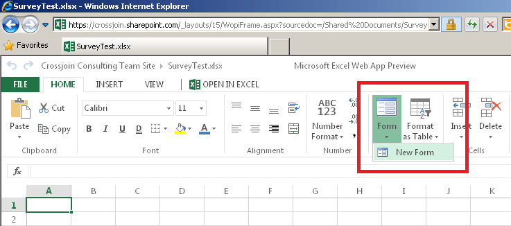
Jamie Thomson and I share a number of… obscure enthusiasms. For instance, last week when he spotted the new forms/surveys feature in the Excel 2013 Web App (see here for a mention) he knew I’d be excited. And I was. Excited enough to devote a whole blog post to them.
What is this feature? Basically a rip-off of homage to the Google docs functionality I mentioned here that allows you to create simple questionnaires and save the data back to a spreadsheet. To use it you need to create a new Excel spreadsheet in the Excel Web App (I can’t seem to find it in desktop Excel and it may not even exist there), then click on Form/New Form in the ribbon:
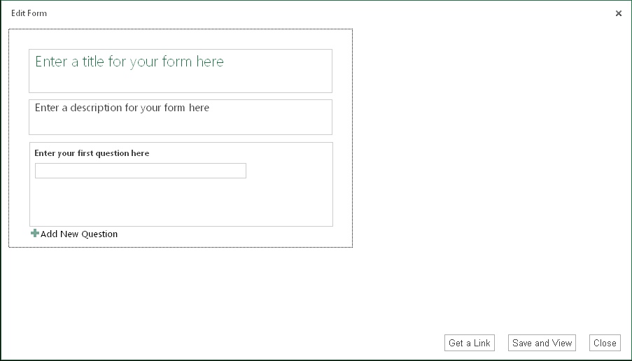
This opens a new dialog where you can create your form/survey:
It’s all pretty self-explanatory from there, you just enter a title and description and then some questions, which can be various types (returning text, numbers, multiple choices etc):
You can then answer the questions yourself or send a link out to other people so they can too:
If you’d like to take the survey you can do so here btw.
The data then lands in a table in the original Excel spreadsheet, ready for you to do something useful with it:
Unfortunately I couldn’t get it to work. Whether this is a temporary problem or a limitation with Office 365 (as opposed to on-prem Sharepoint) I don’t know… if someone knows how to make it work, though, I’d be much obliged if you could leave a comment.
UPDATE: First of all, if you can’t see the survey don’t worry – the service seems to be very unreliable. Secondly I’ve got the OData feed working now and will blog about it later.
In part 1 of this series I showed how to build a BI dashboard with UK weather data in Excel 2013. What I’m going to do now is show, very quickly, how this dashboard can be shared with other people via a web browser.
Before I do that, though, an aside: I found a bug in the preview version of Excel 2013 which means that the dashboard I built in the previous post won’t work with what I’m going to describe here. It’s related to how I imported the data – in my last post I imported data from the Azure DataMarket from the Data tab, and what I’ve had to do for this post is import data from inside the PowerPivot window instead. In a way it’s a good thing I did this because the UI for importing data from the Azure DataMarket in PowerPivot is much better than what I showed before (although it too is quite buggy at the moment). No more fumbling around for account keys and OData queries in the way that Rob Collie complains about here, it’s all handled from within the wizard. All you need to do is pick a data set:
And then check the tables you want and optionally apply filters to certain columns that support it:
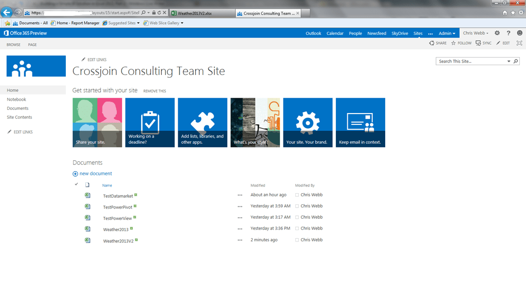
Anyway, with my workbook rebuilt, the next thing I’m going to do is save it. There’s actually a lot more to saving in Office 2013 than you might expect, and certainly lots of different options for places to save stuff too, so I recommend you read this post to get a feeling of what’s possible. I’ve signed up for the Office 365 Professional Plus Preview which means I have access to all kinds of cloud-based services including Sharepoint in the cloud, so I can save my workbook up to Sharepoint:
I can then go to my Sharepoint site on another computer and view and interact with my dashboard using Office Web Apps in the browser:
Yes, that’s my Power View dashboard in a web browser – and I can change filters and it all works! Here’s my PivotTable:
I can not only drill down, but I can even change what’s on rows and columns by dragging and dropping fields in the Field list in the usual way. It’s a bit slow and (again) a bit buggy at the moment, but by RTM I can see this being a big selling point: anyone with Office 365 will have in place everything they need not only for BI on the desktop, but for sharing their reports over the web (though data refresh may be a problem here). I’m very impressed, and it’s good to see such a strong answer to the question I asked here last year.
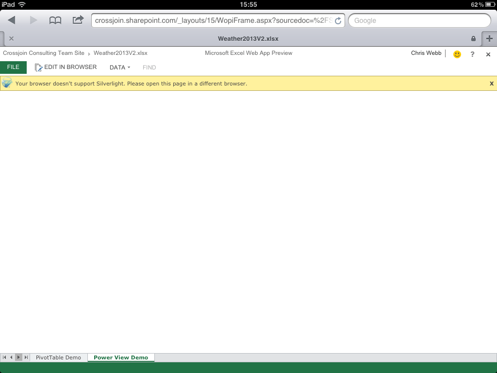
Finally, the question I know you’re all dying to ask. Does this work on an iPad? Well, yes and no. The PivotTable works properly and there’s no loss of interactivity, although I’d say that the touch interface doesn’t work all that smoothly yet:
Unfortunately the Power View sheet doesn’t work at all – no Silverlight!
Oh well, maybe that was too much to ask for… this is clearly not the Microsoft mobile BI solution that was promised at PASS last year. That’s not to say it isn’t useful though – there’s still some good stuff you can do with PivotTables and regular Excel sheets. I’m still very happy with what’s been delivered so far!
nsurprisingly there’s been a lot of interest in Office 2013 since it was announced yesterday, and I’m certainly very excited by all of the new BI features in it. Luckily I wasn’t working today so I had the chance to have a proper play with it, and I thought it would be useful to walk through the process of building a simple BI solution in Excel 2013 to show off some of the new features.
Let’s start with a blank workbook:
Some people don’t like the new look for Office, but I quite like it. You can even set custom backgrounds: you may just be able to see some wispy clouds in the top right-hand corner of the screenshot above. But anyway, to business. To import some data, I first need to go to the Data tab as normal:
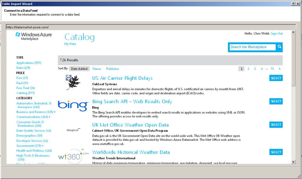
As you can see there are some new options available here, and I’m going to go to the Windows Azure Marketplace. Actually, I’m going to cheat a little and just say that I’m going to import the UK weather forecast from 12:00am today (July 17th) along with some related tables as described in this blog post. The UI for the import wizard is plain but functional:
Interestingly, the data is always imported at the end of the wizard even if I check the ‘Only Create Connection’ option on the last step of the wizard.
Once the data from all the tables has been imported, I need to specify some relationships. I can either do this by clicking on the Relationships button in the Data tab or (better still) going to the PowerPivot window and using the Diagram View. Now as I said yesterday, xVelocity in-memory database is now integrated into Excel but I still need to use the PowerPivot addin in some cases; The PowerPivot addin comes bundled with Excel 2013 but isn’t enabled by default, so in order to use it I first need to enable it; the steps to do this are detailed here. I can then click on the Manage button in the PowerPivot tab to open the PowerPivot window:
And then build some relationships between my tables in Diagram View, which can be reached by clicking on the small Diagram button in the very bottom right hand corner of the PowerPivot window. Once in the Diagram View, building relationships is simply a matter of dragging one column onto another:
I can also build hierarchies here; Duncan Sutcliffe shows how to do this here, and also how to use hierarchies in Power View which is something new. I’ve created a hierarchy going from Region to Weather Station.
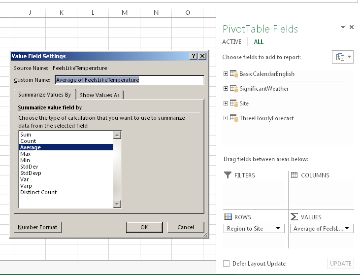
With that done I can of course build a PivotTable. The first thing I’ve noticed is that there isn’t now a separate type of PivotTable for PowerPivot, which is kind of a shame because this means that you don’t seem to be able to create Slicers in the Field List any more, and have to go up to the Ribbon. It’s good for consistency though I suppose. Measure aggregation and number formats are all handled in the Value Field Settings dialog:
There’s a new type of Slicer available too for dates called the TimeLine which Raphael has a lot of good detail on here.
Here’s what the new Quick Explore option, which provides some options on where to drill to and for charts to create, looks like when I hover over a Region on Rows:
Really, though, the thing to do is to create a Power View sheet. This can be accomplished by going to the Insert tab and clicking the Power View button:
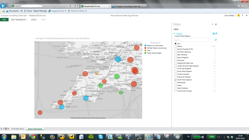
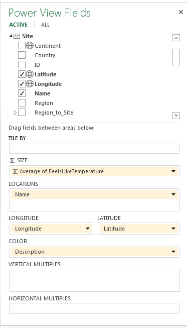
This is where things get exciting. Power View in Excel now supports maps and because my weather data contains the latitude and longitude of all of the weather stations in the UK it’s very easy to plot each weather station on a map and visualise the temperature and predicted weather for each station. To do this I just need to drop the Region Name column onto the Filters selection (choosing a region reduces the number of Weather Stations displayed down to a manageable number for the purposes of this demo), then drop the Latitude and Longitude columns onto the main canvas, turn the resulting table into a map, and then set the size of the markers to show temperature and the colour to show the type of weather:
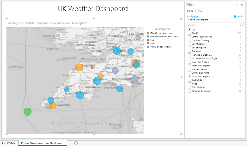
I’ll be speaking at SQL South West this week so what’s the weather like down there at the moment?
From this I can see that today there’s fog in the Scilly Islands (shown by the green marker in the bottom left hand corner) and that it’s very cold and foggy in Liscombe (shown by the small red marker in the middle of the map). This dashboard was ridiculously easy to create, by the way, and I am already completely in love with Excel 2013 simply because of Power View – it’s a killer feature in my opinion.
At this point we’ve got a working self-service BI solution, made very quickly in Excel 2013 and it’s something that every competent Excel user would be able to achieve.
In Part 2, you’ll see how you can share this solution with your co-workers in the Office Web App.
In addition to the core OData version 3.0 protocol found here, the Technical Committee will be defining some key extensions in the first version of the OASIS Standard:
OData Extensions for Data Aggregation– Business Intelligence provides the ability to get the right set of aggregated results from large data warehouses. OData Extensions for Analytics enable OData to support Business Intelligence by allowing services to model data analytic "cubes" (dimensions, hierarchies, measures) and consumers to query aggregated data
Follow the link in the quoted text – it’s very interesting reading! Here’s just one juicy quote:
OData services expose a data model that describes the schema of the service in terms of the Entity Data Model (EDM), an Entity-Relationship model that describes the data and then allows for querying that data. The responses returned by an OData provider are based on that exposed data model and retain the relationships between the entities in the model. Adding the notion of aggregation to OData, without changing any of the base principles in OData as is, has two sides to it: 1. Means for the server to describe an “analytical shape” of the data represented by the service 2. Means for the client to query an “analytical shape” on top of any given data model (for sufficiently capable servers/services) It’s important to notice that, while each of these two sides might be valuable in its own right and can be used independently of the other, their combination provides additional value for clients. The descriptions provided by the server will help a consumer understand more of the data structure looking at the service’s exposed data model from an analytics perspective, whereas the query extensions allow the clients to express an “analytical shape” for a particular query. The query extensions will also allow clients to refer to the server-described “analytical shape” as shorthand.
One of the authors, Siva Harinath, I know from the SSAS dev team and it’s easy to see how this extension for OData would be incredibly useful for Microsoft BI. Not only could you imagine cloud-based SSAS (when it finally arrives) being queryable via OData, but it would allow an OData provider to not only of supply raw data to PowerPivot but the design of the PowerPivot model itself.
I don’t always agree with everything Rob Collie says, much as I respect him, but his recent post on the Windows Azure Marketplace (part of which used to be known as the Azure Datamarket) had me nodding my head. The WAM has been around for a while now and up until recently I didn’t find anything much there that I could use in my day job; I had the distinct feeling it was going to be yet another Microsoft white elephant. The appearance of the DateStream date dimension table (see here for more details) was for me a turning point, and a month ago I saw something really interesting: detailed weather data for the UK from the Met Office (the UK’s national weather service) is now available there too. OK, it’s not going to be very useful for anyone outside the UK, but the UK is my home market and for some of my customers the ability to do things like use weather forecasts to predict footfall in shops will be very useful. It’s exactly the kind of data that analysts want to find in a data market, and if the WAM guys can add other equally useful data sets they should soon reach the point where WAM is a regular destination for all PowerPivot users.
Importing this weather data into PowerPivot isn’t completely straightforward though – the data itself is quite complex. The Datamarket guys are working on some documentation for it but in the meantime I thought I’d blog about my experiences; I need to thank Max Uritsky and Ziv Kaspersky for helping me out on this.
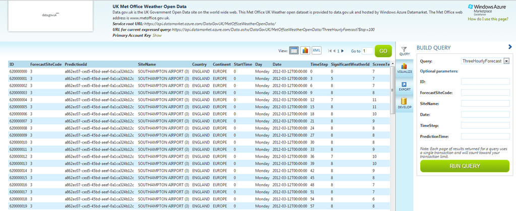
The first step in the process of importing this data is to go to the Azure Marketplace and construct a query to get the slice of data that you want – this is a big dataset and you won’t want to get all of it. Once you’ve signed in, go to https://datamarket.azure.com/dataset/0f2cba12-e5cf-4c6d-83c9-83114d44387a, subscribe to the dataset and then click on the “Explore this Dataset” link:
This takes you to the query builder page, where you get to explore the data in the different tables that make up this dataset:
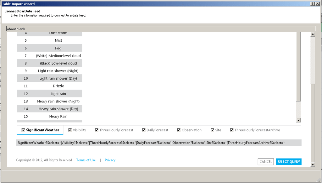
You choose the table you want to explore in the confusingly-named ‘Query’ dropdown box on the right-hand side of the screen. The available tables are:
ThreeHourlyForecast, a fact tables containing three hourly weather forecasts
ThreeHourlyForecastArchive, a fact table containing aggregated, averaged values for the various forecasts for a given date and time
SignificantWeather, a dimension table containing the different types of weather that can be forecast
Visibility, a dimension table containing the different levels of visibility
DailyForecast, a fact table containing daily weather forecasts
Observations, a fact table containing observed weather
Site, a dimension table containing all the UK’s weather stations
Once you’ve selected a table you can construct a filter by entering values in the Optional Parameters boxes below the query dropdown. These changes are then reflected in the URL shown at the top of the screen:
This URL represents an OData query. One thing I didn’t notice initially is that the query that is generated here includes a top 100 filter in it which you’ll need to remove (by deleting &$top=100 from the end of the URL) if you want to do anything useful with the data; you might also want to build a more complex query than is supported by the query builder, and you can learn how to do this by reading this article.
In my case I decided to look at the full three hourly forecast data. As I said, this is a big dataset – initially I thought I’d download the whole thing, but 18 million rows and several hours later I cancelled the import into PowerPivot. Instead I opted to look at data for the whole of the UK for just one forecast made on one day, which worked out at a more manageable 250000 rows. What’s not clear from any of the current documentation is what all of the columns in the three hourly forecast fact table represent:
Date is the date the forecast is issued
StartTime is the time the forecast is issued and is either 0, 6, 12 or 18, representing midnight, 06:00, 12:00 and 18:00 – new forecasts are issued every 6 hours
PredictionTime is the time that an incremental update to a forecast is issued; these incremental updates appear every hour. PredictionTime is an actual time value going from 0 to 23 representing the hour the incremental update was issued.
TimeStep is an offset in hours from the StartTime, and represents the time that the forecast is predicting the weather for. It ranges in value from 0 to 120, going up in 3s (so the values go 0, 3, 6, 9… 120), meaning we have weather predictions for 5 days into the future for each forecast.
Therefore, for any given row in the ThreeHourlyForecast table, if the Date is April 10th 2012, StartTime is 6, PredictionTime is 8 and TimeStep is 9, then this is data from a forecast that was issued on April 10th 2012 at 8am (the second incremental update to the 6am forecast) and this row contains the prediction for the weather for the time StartTime+TimeStep = 6 + 9 = 15:00 on April 10th 2012.
Here’s the OData url I used to grab data for the three hourly forecast issued on April 10th at midnight (StartTime=0 and PredictionTime=0) for all weather stations and all time steps:
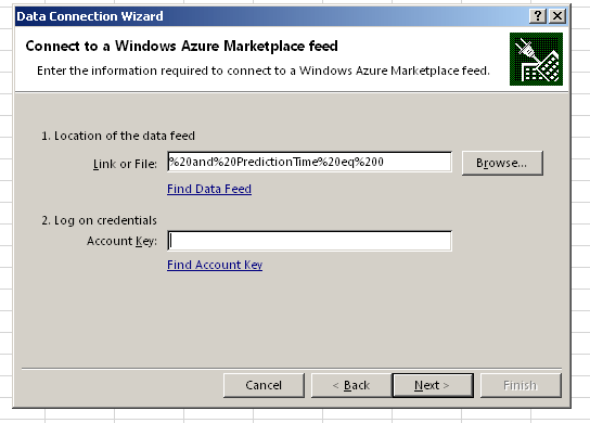
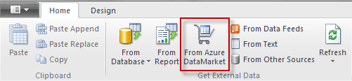
To use this URL in PowerPivot, you need to create a new PowerPivot workbook, open the PowerPivot window and then click the From Azure DataMarket button:
Then enter your query URL and Account Key (which you can find on the Query Explorer page by clicking on the Show link, as indicated in the screenshot above):
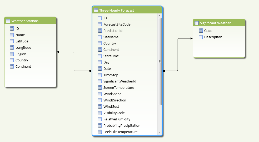
Having imported this data I also imported the whole of Site (renamed here to Weather Stations) and SignificantWeather tables to give the following PowerPivot model:
Here are the joins I used:
I also created a few calculated columns, including one called ActualPredictionForStart which added the TimeStep to the Start Time and the Date to get the actual date and time that the prediction is for:
=[Date] + (([StartTime] + [TimeStep])/24)
With this all done, I was able to find out what the predicted weather for the current time and my home town was in this (as of the time of writing) two-day old forecast:
…and do all the usual PivotTable-y and chart-y things you can do with data once it’s in Excel:
Incidentally, the forecast is wrong – it’s not raining outside right now!
PivotTables and Excel charts are all very well, but there’s a better way of visualising this data when it’s in Excel – and in my next post I’ll show you how…